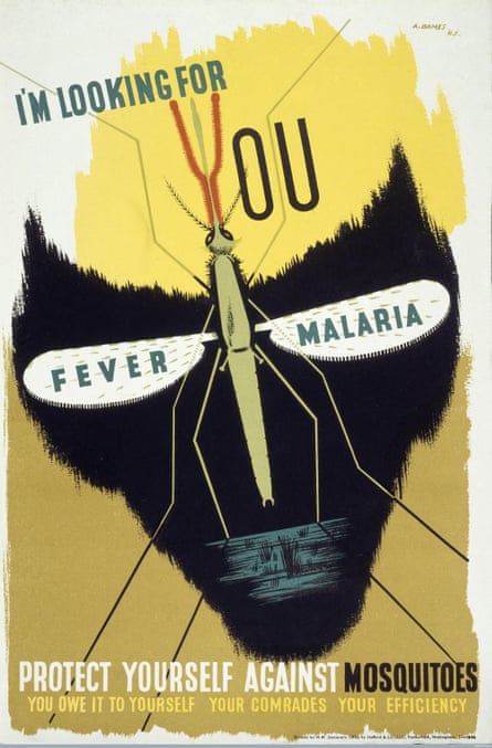
If graphic design can save your life, it is eminently capable of killing you, too. That’s the conflicted message at the heart of a powerful new exhibition at the Wellcome Collection, which explores graphic design’s complex relationship with health, medicine, and the world of big pharma – and the different ethical positions that designers choose to take.

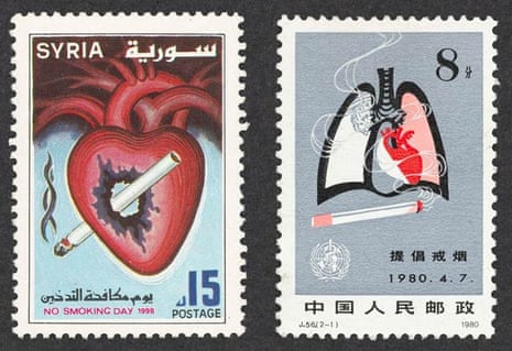
The show opens with a hard-hitting section on smoking, where creatives’ seductive and lucrative attempts at selling tobacco over the years are paired with their equally clever efforts to encourage people to kick the habit. We find the iconic Lucky Strike roundel by Raymond Loewy – reproduced on T-shirts and baseball caps – alongside the Silk Cut campaign masterminded by Charles Saatchi in the early 1990s. The glossy billboards, featuring luscious photographs of skeins of purple silk being slashed and sliced, were an ingenious response to the growing constraints on tobacco advertising, which explicitly prohibited the naming of brands. Instead, the increasingly surreal and impenetrable compositions of silk and polished metal offered a reward to the cognoscenti capable of deciphering the coded message. Silk Cut sales soared, their loyal customers enticed by the prospect of collecting the artworks as miniature cards along the way.
By contrast, we are then shown the result of market research agency GfK’s quest to find “the ugliest colour possible” with which to wrap Australia’s new plain cigarette packets, following the government’s 2012 ruling prohibiting the branded packaging of tobacco. They settled on Pantone 448C – AKA “opaque couché” – a queasy shade of greenish brown. The muddy hue is now used to cover the 25% of the packet not already taken up with gory photos of tar-addled lungs and rotting gums. It seems to have had the desired effect. An Australian government report estimated that the number of smokers fell by more than 100,000 in the three years following the introduction of the new sickly brown packets.

The World Health Organisation has called on every government to take up the plain packaging pledge, thereby firmly cementing the role of graphic design as a key battleground in the war on smoking. Design sells, but it can equally put you off picking up a cancer stick ever again.
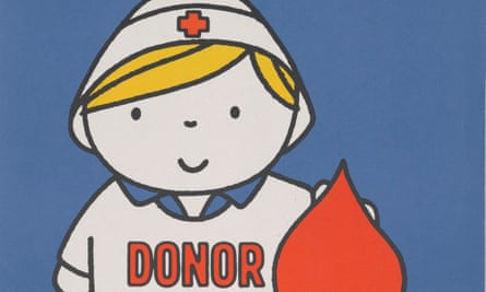
The exhibition is full of other examples of the provocative power of graphics in ramming public health messages home, from the famous Don’t Die of Ignorance Aids awareness campaign – which saw every UK household leafleted with a mock tombstone in the 1980s, to the Kill Jill adverts, designed to encourage organ donation in Scotland. Presenting viewers with the choice of killing someone, by deciding whether or not to sign up as a donor, the campaign was subject to a litany of complaints. But the shock tactic paid off: donor registration surged by 300%.
The sensationalism is stirring, but the show also demonstrates graphic designers’ capacity to inform and explain with subtlety and sophistication. The section on hospitals includes a thoughtful initiative by design agency PearsonLloyd aimed at reducing violence caused by frustration due to unexplained delays in accident and emergency departments. The designers installed a series of clear information panels throughout A&E areas, explaining every stage of the process, from the waiting room to triage and consultation, that also provided live waiting times. Following a one-year trial, violent incidents fell by 50%.
A similar no-brainer solution comes in the form of the “communi-cards” developed by designers Poulin + Morris in the 1980s. As colour-coded charts of simple pictograms, the cards allow patients to communicate with doctors, identifying the type of pain, its location and severity, without requiring spoken language. First introduced in New York, they are in use in 150 hospitals across North America.

If the ability of graphic design to transcend language barriers is the overarching theme, it is particularly evident in the section on the rise of the big pharma companies, driven by the need to differentiate their brands with a strong visual identity. We see the brand development of Bayer, whose circular logo could be easily stamped on its aspirin pills, and the beautiful packaging of Swiss pharma giant Geigy, who commissioned leading designers of the 1950s and 60s to design sleek abstract graphics for their drugs – which might tempt you to become a junkie from the boxes alone. On the package of Petrofran, for “rapid resolution of depressive states”, a ball and chain runs around the box. The chain links are triumphantly broken when a perforated strip around the middle of the package is torn open.
Ultimately, it is fitting that the exhibition should be held here in the Wellcome Collection, given that Henry Wellcome – whose company first patented the “tabloid”, or tablet, in the 1880s – was one of the most savvy marketers of them all. Hailing from a sales background, he was the first to establish the practice of direct marketing to doctors. From 1890, he also started giving out branded appointment diaries as promotional gifts, beginning the cosy practice of pharmaceutical companies showering medical practitioners with merchandise – which has helped to keep the drugs giants, and their designers, in business ever since.

Comments (…)
Sign in or create your Guardian account to join the discussion